Nutrition Month Poster Philippines 2026: Ideas, Themes, Slogans & NNC Guide
A Nutrition Month poster is a creative visual display that promotes healthy eating, proper nutrition, environmental care, and sustainable food practices. In the Philippines, these posters support the annual National Nutrition Council (NNC) campaign by presenting its official theme through illustrations, colours, slogans, and informative messages designed for students, families, communities, schools, and public awareness activities.
What Is a Nutrition Month Poster?
A nutrition month poster is a visual advocacy material designed to communicate an important Nutrition Month message through illustrations, colours, short text and a strong central idea.
For students, it may be a hand-drawn entry for a school activity or poster-making competition. Teachers and nutrition advocates may use larger versions for classroom displays, bulletin boards, community events or public information activities.
The strongest designs normally have one obvious message. Instead of filling the page with many unrelated drawings, build the composition around a central concept and allow every supporting element to reinforce it.
For the 2026 campaign, the NNC’s official branding provides a useful visual direction: the campaign logo combines half Earth and half a basket of Filipino foods, representing the connection between environmental protection, climate action and nutrition security. The branding guide also explains that the food basket represents locally available, culturally relevant and sustainable food choices.
Why the Theme Matters
A beautiful drawing can still become a weak competition entry if its message does not clearly connect with the official theme.
Your nutrition month poster should therefore answer one simple question:
How does protecting the environment help people access nutritious and sustainable food?
This could be shown through:
- Healthy Filipino food and local crops
- Farmers and fishers
- Community or school gardens
- Clean water and healthy soil
- Forests and oceans
- Children and families eating balanced meals
- Climate-resilient farming
- Reduced food waste
- Locally produced and seasonal foods
- Community cooperation
The NNC’s 2026 campaign specifically encourages sustainable food practices, reduced food waste, local and climate-resilient food production, and stronger nutrition programmes.
2026 Nutrition Month Theme and Poster Direction
Before starting your artwork, verify the current campaign information from the official NNC website rather than relying on an old poster, social-media graphic or previous year’s template.
Official 2026 Campaign Message
Overarching theme:
“Sa PPAN: Sama-sama sa Nutrisyong Sapat Para sa Lahat”
2026 sub-theme:
“Nutrisyon at Kalikasan, Ating Pangalagaan!”
The sub-theme highlights the relationship between environmental protection and nutrition. According to the NNC, healthy and resilient food systems depend on protecting natural resources, while climate-related changes can affect agriculture, fisheries, food supply and access to nutritious diets.
The Philippine Plan of Action for Nutrition (PPAN) 2023–2028 provides the wider policy framework behind the campaign. The NNC describes PPAN as a six-year strategic and directional plan intended to guide stakeholders towards improved nutrition outcomes.
5 Creative Nutrition Month Poster Ideas
You don’t need an extremely complicated illustration to create a memorable entry. A focused concept with good composition can communicate more effectively than a page packed with details.
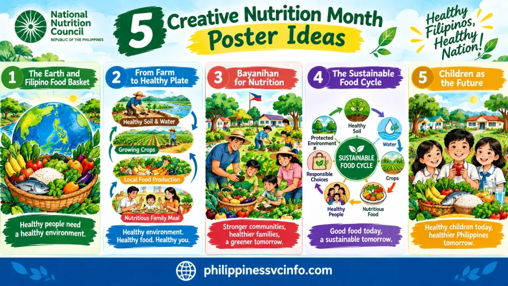
1. The Earth and Filipino Food Basket
Create a large circle representing Earth and combine it visually with a basket containing nutritious Filipino foods.
You could illustrate vegetables, fruits, rice, fish and other locally available foods around the central image. Green landscapes, water and trees can surround the composition.
This idea works particularly well for the 2026 theme because it visually connects the environment with food and nutrition.
Main message:
Healthy people need a healthy environment.
2. From Farm to Healthy Plate
Show a visual journey beginning with healthy soil and water, moving towards crops and local food production, and ending with a nutritious family meal.
Use arrows or a curved pathway to connect each stage. This gives the viewer an immediate understanding of how environmental care and food production are connected.
A child, parent or farmer can become the main human figure in the composition.
3. Bayanihan for Nutrition
A community-based design can show Filipino families, farmers, young people and other community members working together in a garden.
Place vegetables and fruit crops in the foreground while showing a clean environment in the background.
The idea is simple: nutrition is not only an individual concern. Communities can work together to support healthier and more sustainable food systems.
4. The Sustainable Food Cycle
Turn the entire poster into a circular story.
Start with:
Healthy soil → water → crops → nutritious food → healthy people → responsible choices → protected environment
A circular layout makes the artwork visually interesting while giving the audience a clear message about sustainability.
5. Children as the Future
Place children or students at the centre of the design, surrounded by nutritious food, trees, clean water and community gardens.
The background can show a healthy environment, while the foreground presents a balanced meal.
This approach is particularly suitable for school-based activities because the message can connect today’s environmental choices with the health of future generations.
How to Choose the Best Poster Concept
If you’re unsure which idea to use, don’t start drawing immediately. First decide what you want the viewer to notice within the first few seconds.
A practical selection method is:
| If you want to emphasise… | Consider this concept |
|---|---|
| Environment + nutrition | Earth and food basket |
| Agriculture | Farm-to-plate design |
| Community participation | Bayanihan concept |
| Sustainability | Food cycle |
| Children and education | Future generations |
Keep one dominant focal point. Secondary illustrations should support that focal point rather than compete with it.
A Useful Design Rule
Before adding text, look at your rough sketch from a distance.
Can someone identify the main idea without reading the slogan?
If the answer is yes, your composition is probably working. If everything appears equally important, simplify it before moving to the colouring stage.
Where to Find Official Nutrition Month Materials
The NNC publishes campaign resources and advocacy materials through its official website. For 2026, the available materials include a campaign briefer, branding guide, campaign logos, a logo with the sub-theme, banner/streamer templates, social-media campaign templates, a virtual background, Twibbon frame, prayer, pledge and talking points.
This matters when preparing a nutrition month poster for an organisation or school because using the current official campaign identity helps prevent confusion with previous campaigns.
The NNC’s 2026 Branding Guide also states that campaign materials should display the prescribed government logos in the required order and follow the approved branding guidelines.
Important: If your school or organisation provides its own competition rules, follow those rules for size, materials, logo use and submission requirements. The NNC campaign page and branding guide should be treated as the official reference for the national campaign message and branding.
Before You Draw: A Simple Planning Checklist
Prepare these items before opening your art materials:
- Current NNC Nutrition Month theme and sub-theme
- One clear poster concept
- Main illustration
- Supporting visual elements
- Short slogan or campaign message
- Appropriate paper or illustration board
- Pencil and eraser
- Fine liner or marker, if permitted
- Chosen colouring medium
- Ruler for borders and lettering
- Reference to official NNC campaign materials
Most importantly, check the current NNC material first. The official campaign changes from year to year, so copying a previous Nutrition Month poster can result in the wrong theme or branding.
Choosing the Right Poster Size
There isn’t one universal poster size for every Nutrition Month activity. The exact dimensions can depend on the school, organiser, local government unit or competition rules.
For a classroom or school artwork, practical choices may include:
| Format | Suitable use |
|---|---|
| Short bond paper | Small classroom activity |
| Long bond paper | Individual school poster |
| 1/4 illustration board | Larger student artwork |
| Cartolina or illustration board | Display or competition entry |
| Large-format board | Exhibit or public display |
If your teacher or contest organiser has supplied a required size, follow that requirement first. Don’t resize the artwork simply because another Nutrition Month poster uses a different format.
Leave a Safe Border
A border gives the composition breathing room and helps prevent important text or artwork from sitting too close to the edge.
A practical starting point is around 0.5 to 1 inch, unless the competition specifies another margin.
Before drawing, lightly mark the border with a ruler. This small step can make the finished nutrition month poster look considerably more organised.
Build the Composition Before Adding Colour
One common mistake is reaching for coloured pencils or paint too early.
Instead, divide your page into three visual levels:
1. Main focal point
The largest and most noticeable element.
2. Supporting illustrations
Food, plants, people, water, soil, farms or other elements that reinforce the message.
3. Text area
The campaign theme, slogan or short explanatory phrase.
For example, an Earth-and-food concept could place the main globe in the centre, a food basket across the lower portion, and trees, crops and people around the sides.
The viewer’s eye should move naturally from the main illustration to the supporting details and then to the message.
Don’t Fill Every Empty Space
White or lightly coloured space isn’t wasted space.
Leaving a small area uncluttered can make your main drawing and slogan easier to see. A poster filled with dozens of fruits, leaves, characters and words may look busy rather than creative.
A useful test is to step several metres away from your artwork. If you can still identify the main image and message, the composition is likely working.
Colour Planning for a 2026 Nutrition Month Poster
Colour should reinforce the environmental and nutrition message rather than simply make the page bright.
The official 2026 NNC Branding Guide provides prescribed typography and colour guidance for campaign materials to maintain a consistent visual identity. It identifies Archivo Black and Poppins among the suggested fonts for campaign materials.
For a student-created hand-drawn poster, you don’t necessarily need to reproduce every digital branding specification. However, you can take inspiration from the campaign’s visual direction.
A Practical Colour Structure
Consider assigning colours according to the role they play:
- Green: plants, leaves, forests and environmental protection
- Blue: water, sky and clean natural resources
- Yellow or warm tones: sunlight, grains and energy
- Red or orange: selected fruits, vegetables or emphasis
- Natural earth tones: soil, farms and baskets
- White or light backgrounds: space for readable text
Avoid using every available colour at equal intensity. Select a small family of dominant colours and then use stronger shades only where you want attention.
Create Depth With Light and Dark Shades
Suppose you’re drawing a basket of vegetables.
Start with the lighter base colour. Add darker tones underneath vegetables, inside the basket and where objects overlap. Then use highlights sparingly on the upper surfaces.
This makes flat drawings appear more dimensional.
The same technique works for:
- Leaves
- Fruits
- Rice fields
- Mountains
- Water
- Human figures
- Baskets
- Earth or globe illustrations
How to Letter the Nutrition Month Message
Typography is often overlooked in hand-drawn poster competitions.
You can create an excellent illustration and still weaken the final result if the campaign message is difficult to read.
For the 2026 campaign, make sure any official wording you reproduce is copied accurately from the NNC’s current materials. The official sub-theme is:
“Nutrisyon at Kalikasan, Ating Pangalagaan!” National Nutrition Council
If you include the overarching campaign theme, check its exact spelling and punctuation against the official NNC resource before finalising the artwork.
Three Lettering Rules
Make the main message large.
Someone standing several steps away should be able to read it.
Use strong contrast.
Dark lettering over a pale background or light lettering over a sufficiently dark area is easier to read.
Don’t distort the words to fit.
If your text is too long for the available space, redesign the layout rather than squeezing the letters together.
If you’re creating a digital version, the NNC Branding Guide’s suggested fonts can help maintain a closer connection with the official campaign identity.
Step-by-Step: How to Make a Nutrition Month Poster by Hand
Once the concept and layout are ready, work from broad shapes towards fine details.
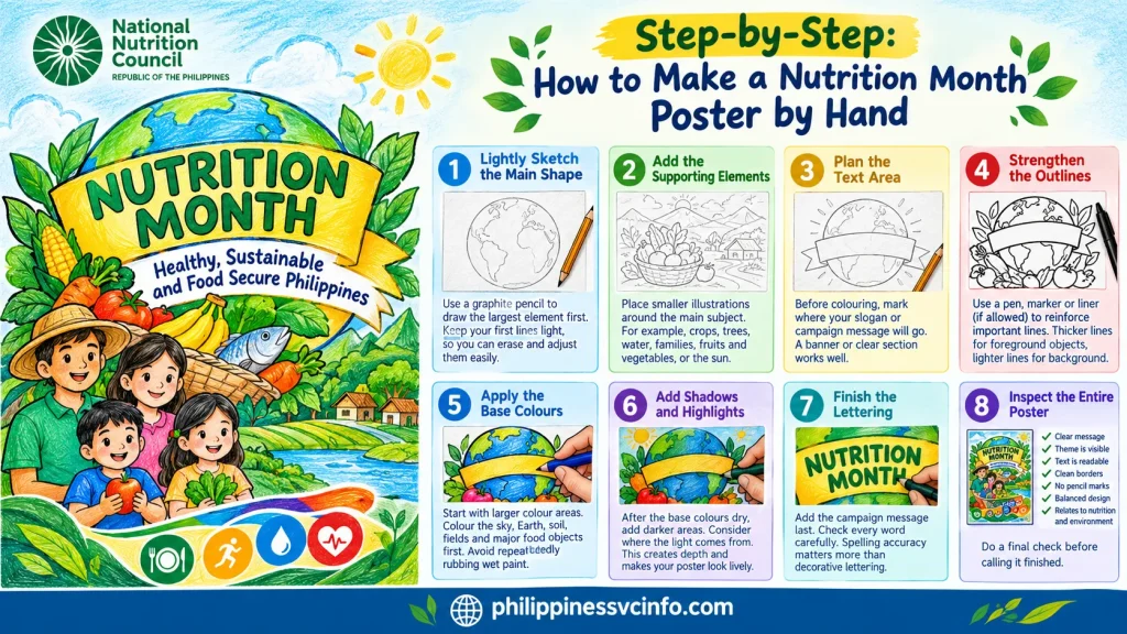
Step 1: Lightly Sketch the Main Shape
Use a graphite pencil to draw the largest element first.
For an Earth-based design, this might be a large circle. For a farm concept, it could be a farmer, field or basket.
Keep your first lines light. You should be able to erase and adjust them without damaging the paper.
Step 2: Add the Supporting Elements
Place smaller illustrations around the main subject.
For example:
- Crops around the bottom
- Trees in the background
- Water flowing through a landscape
- Children or families near the foreground
- Fruits and vegetables around a basket
- Clouds or sunlight above the scene
Don’t make these elements larger than your main focal point unless the concept specifically requires it.
Step 3: Plan the Text Area
Before colouring, mark where your slogan or campaign message will go.
This prevents a common problem: finishing the entire drawing and then discovering there is no suitable space for the text.
A banner, curved text area or clean section of sky can work well.
Step 4: Strengthen the Outlines
Once you’re satisfied with the pencil drawing, reinforce important lines with an appropriate pen, marker or liner if your competition rules allow it.
Use heavier lines for foreground objects and lighter visual treatment for background elements.
If the artwork is for a contest, check the rules before using any particular medium.
Step 5: Apply the Base Colours
Start with larger colour areas.
For instance, colour the sky, Earth, soil, fields and major food objects before working on tiny details.
Avoid repeatedly rubbing or layering wet paint over the same area, as this can damage the paper.
Step 6: Add Shadows and Highlights
After the base colours dry or settle, introduce darker areas.
Think about where the light is coming from. Objects facing the light can remain brighter, while overlapping or lower areas can receive deeper shading.
This creates visual depth without requiring advanced drawing skills.
Step 7: Finish the Lettering
Add the campaign message after the surrounding artwork is stable.
Check every word carefully.
For an official campaign phrase, spelling accuracy matters more than decorative lettering.
Step 8: Inspect the Entire Poster
Before calling it finished, check:
- Is the main message obvious?
- Is the theme clearly represented?
- Can the text be read from a distance?
- Are the borders clean?
- Are there visible pencil marks?
- Is the artwork balanced?
- Are any objects covering the text?
- Does the design relate to nutrition and environmental protection?
A final inspection can catch mistakes that aren’t obvious while you’re concentrating on individual sections.
Beginner Drawing Tricks That Make a Poster Better
You don’t need advanced artistic training to create a convincing composition.
Start With Basic Shapes
Almost every complicated illustration can be simplified.
Use:
- Circles for fruit and Earth
- Ovals for plates
- Rectangles for signs
- Triangles for mountains
- Curved lines for leaves
- Simple cylinders for containers
- Basic shapes for people
Draw the basic structure first, then add details.
Use Layering to Show Depth
Objects in the foreground should generally appear larger and clearer than distant objects.
For example, place a large basket of vegetables in front and a smaller farm landscape behind it.
You can also overlap objects slightly. A leaf partially covering a fruit makes the composition feel less flat.
Blend Oil Pastels Carefully
If you’re using oil pastels, apply a strong base colour and then introduce a darker shade near the edges.
Blend gently using a tissue, cotton bud or another method permitted by your activity.
Don’t blend every colour completely. Some visible strokes can add character and texture to the artwork.
Slogan Ideas for a Nutrition Month Poster
Your slogan should support the campaign rather than distract from it.
For a 2026 poster, you could develop original lines around the relationship between nutrition and nature, such as:
- “Nutrisyon at Kalikasan, Ating Pangalagaan!”
- “Alagang Kalikasan, Masustansyang Kinabukasan.”
- “Masustansyang Pagkain, Likas-Yamang Ingatan.”
- “Sama-Sama Para sa Kalusugan at Kalikasan.”
- “Alagaan ang Kalikasan, Palakasin ang Nutrisyon.”
If you’re entering an official competition, check whether the organiser requires the official NNC wording, allows an additional slogan, or asks participants to create their own slogan.
The safest approach is to keep your original creative line secondary when the official campaign wording is mandatory.
Common Nutrition Month Poster Mistakes
A strong concept can lose impact because of small presentation problems.
Too Much Text
A poster isn’t an essay.
If the viewer needs to read a paragraph before understanding the message, reduce the text and strengthen the illustration.
Too Many Unrelated Images
A mango, burger, tree, globe, hospital, classroom, farm, ocean and dozens of other objects may individually look attractive, but together they can make the message unclear.
Every major object should have a reason for being there.
Using an Old Theme
Nutrition Month themes change. The NNC’s official site maintains information about different years, so always check the current campaign before beginning a new design.
For 2026, use the current campaign information rather than copying a 2025 design.
Poorly Positioned Logos
If official logos are required, don’t stretch, rotate or distort them.
The NNC’s current branding resources are intended to provide a consistent campaign identity, including prescribed visual elements and typography.
Weak Contrast
Beautiful colours aren’t useful if the slogan disappears into the background.
Before finishing, check whether the text is clearly separated from the illustration behind it.
A Strong 2026 Poster Layout You Can Copy as a Planning Guide
Try this composition before committing to your final drawing:
Top:
Official Nutrition Month campaign wording
Centre:
Large Earth/food-basket illustration
Left side:
Trees, crops, farmer and clean water
Right side:
Children, family and nutritious food
Bottom:
Short supporting message about sustainable food and environmental care
This arrangement naturally connects the environment, food production and human nutrition without requiring excessive text.
The NNC’s own 2026 campaign explains that sustainable food practices, reduced food waste, local and climate-resilient production and stronger nutrition programmes can contribute to resilient food systems and better nutrition.
How to Prepare for a Poster-Making Competition
Competition rules can vary between schools, divisions, municipalities and organisers, so don’t assume that one set of rules applies everywhere.
Your first task should be to obtain the official mechanics from the organiser.
Check:
- Who is eligible to participate
- Required paper or board size
- Whether the work must be completed on-site
- Allowed drawing and colouring materials
- Time limit
- Whether digital references are permitted
- Whether printed materials are allowed
- Whether official logos must be included
- Required theme or slogan
- Submission deadline
- Judging criteria
This is particularly important because a poster that follows the NNC campaign but breaks a local competition rule may still be disqualified.
A Practical Pre-Contest Checklist
Before the activity begins, prepare your materials according to the organiser’s rules.
Basic materials may include:
- Illustration board or required paper
- Graphite pencils
- Eraser
- Ruler
- Pencil sharpener
- Fine liners or markers
- Poster paint, coloured pencils, oil pastels or other permitted medium
- Tissue or cotton buds for blending
- Water container and brushes if using paint
Keep your materials organised. During a timed activity, searching through an untidy bag wastes valuable minutes.
How to Manage a 2–3 Hour Poster Activity
If your organiser gives you approximately two or three hours, don’t spend the first hour perfecting one small illustration.
A better approach is to divide the available time into stages.
| Stage | Main task |
|---|---|
| First 10–15 minutes | Plan the composition |
| Next 20–30 minutes | Pencil sketch |
| Next 40–60 minutes | Base colours |
| Next 30–40 minutes | Shading and details |
| Final 15–20 minutes | Lettering and corrections |
| Last few minutes | Quality inspection |
These timings are only a planning example. Always follow the actual time limit provided by your organiser.
The key is to leave enough time for lettering and final corrections. A beautifully coloured poster with unfinished text can look incomplete.
What Judges May Look For
The exact scoring system depends on the competition. Your supplied competition framework uses categories such as theme relevance, creativity, visual impact, artistic execution and neatness, but the NNC national campaign materials do not establish one universal judging rubric for every school or local contest.
If your organiser provides a scoring sheet, use that as the controlling requirement.
For planning purposes, you can assess your own nutrition month poster using five questions:
1. Does It Clearly Match the Theme?
The viewer should immediately understand the connection between nutrition and the campaign’s environmental message.
A random collection of healthy foods isn’t enough. Your artwork should communicate an idea.
2. Is the Concept Original?
Avoid simply reproducing a poster you’ve seen online.
Use the official campaign message as your foundation, but develop your own visual arrangement, characters, scenery and storytelling.
3. Does It Catch Attention?
A strong focal point, readable lettering and controlled colour contrast can make the poster noticeable from a distance.
4. Is the Artwork Well Executed?
Look for:
- Controlled outlines
- Clean colouring
- Balanced proportions
- Effective shading
- Good composition
- Clear lettering
5. Does It Look Finished?
Remove unnecessary pencil marks, clean the edges and check every word.
Small finishing details can change the overall impression considerably.
A Final Quality-Control Checklist
Before submitting your nutrition month poster, examine it from top to bottom.
Theme Check
☐ Does the artwork represent the current campaign?
☐ Is the environmental connection visible?
☐ Does the design communicate a nutrition message?
☐ Is the main idea understandable without a long explanation?
Artwork Check
☐ Is there one dominant focal point?
☐ Are supporting elements balanced?
☐ Are foreground and background separated clearly?
☐ Are colours harmonious?
☐ Is shading consistent?
Text Check
☐ Is the campaign wording spelled correctly?
☐ Is the slogan readable?
☐ Does the text contrast with its background?
☐ Are important words away from the edge?
Presentation Check
☐ Are borders clean?
☐ Have stray pencil marks been removed?
☐ Is the paper or board undamaged?
☐ Are required logos correctly placed?
☐ Have you followed the organiser’s submission rules?
Where to Verify the Official Nutrition Month Information
For current campaign information, the National Nutrition Council should be your primary reference rather than an old Pinterest design, social-media post or unofficial poster template.
The NNC’s 2026 campaign page provides the current theme, sub-theme, campaign materials and related resources.
You can also consult the NNC’s official 2026 Nutrition Month Branding Guide when you need campaign branding information.
For broader information about Nutrition Month programmes and previous campaign materials, use the NNC’s Nutrition Month section.
The official 2026 campaign information identifies the sub-theme as “Nutrisyon at Kalikasan, Ating Pangalagaan!” and connects the campaign with environmental protection, climate action and sustainable food systems.
Frequently Asked Questions About Nutrition Month Posters
Best Approach for Students, Teachers and General Readers
A student can approach a nutrition month poster as an art project, while a teacher can use the same activity as a lesson about food, sustainability and community responsibility.
For teachers, one useful classroom exercise is to ask students to explain their poster in three sentences:
- What is the main picture?
- What nutrition message does it communicate?
- How does it connect with protecting the environment?
If a student can answer those three questions clearly, the artwork probably has a strong conceptual foundation.
For parents and community groups, the same principle applies. The strongest advocacy artwork isn’t necessarily the most complicated one. It is the one that makes its message easy to recognise and remember.
Final Takeaway
A memorable nutrition month poster doesn’t need hundreds of details. It needs a clear idea that connects the official campaign message with something people immediately recognise.
For the Philippines‘ 2026 campaign, the most useful creative direction is to show that nutrition and nature are connected. Healthy food depends on healthy food systems, while sustainable choices and environmental protection can support better nutrition for communities.
Start with the current NNC theme, sketch one strong visual story, keep the lettering readable, use colour with purpose and check the competition rules before submitting. Most importantly, let the artwork communicate one message clearly rather than trying to tell five different stories on one page.
The official NNC resources should remain your reference point for the current campaign wording and branding, while your illustration can bring that message to life in an original way.
Discover What You Need to Know:
- QQE Dashboard Login Philippines 2026: Teacher Portal, Schedule & Classroom Guide
- Blackboard Mapúa University Philippines 2026: Login, Password Reset, Courses & Student Guide
- Native Camp Guide Philippines 2026: Login, Free Trial, Plans, Lessons & Booking
- MMSU Student Portal Phulippines 2026: Login, Enrollment, Grades, Schedule & Form 5 Guide
- Buwan ng Wika Costume for Male Philippines 2026: Traditional Filipino Outfit Ideas, DIY Tips, and Styling Guide